

There’s a chance to walk with some of Margate’s ghosts as part of the Back and Fill festival this weekend – but not the haunting type.
Signwriter Andrew Hudson, whose Hermetic Sign Company has made a big contribution to Margate’s streets in recent years, is leading a walk that will take in the town’s ‘ghost signs’ – faded adverts on walls and old shop signs.
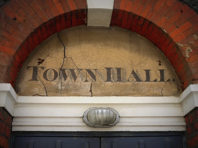
Andrew will talk about the history and evolution of typefaces and their practical usage, and give some insight into the techniques and processes of signwriting and letter-making. And, as old shops and lost businesses are uncovered, there will be a little bit of Margate history, too.
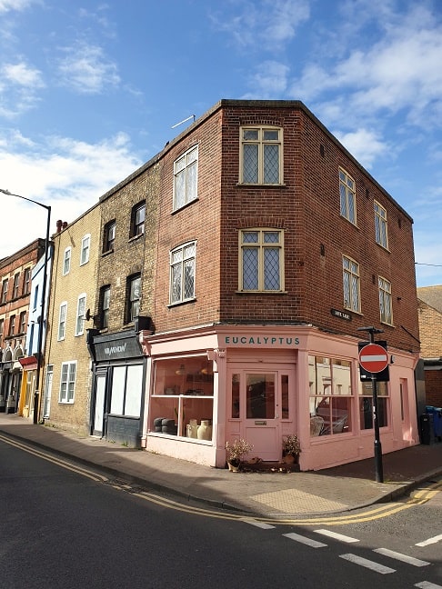
Andrew’s work can be seen at Lovely’s, Cliffs and Quo Vadis on Northdown Road, and The Greedy Cow, Margate Bookshop, and Eucalyptus in the Old Town. He has recently painted a new sign for Harbour Books in Whitstable. Some of his work will be included in the walk.
The walk takes place on Saturday (October 24) at 2pm. It has very limited numbers, because Back and Fill is a Covid-safe event, so it will be shared online as it happens. Follow Marine Studios, Margate on social media to find out more.
For further information about Back and Fill, a series of seaside festivals around the UK happening in the half term holiday, visit www.backandfill.uk
