

By Dan Thompson
Learning To See, the new exhibition by Bridget Riley at Turner (formerly Turner Contemporary) is a perplexing exhibition.
On one hand, it’s a collection of mostly large-scale works by a superstar artist, and it feels like this is exactly what architect David Chipperfield designed the building for. Work and walls are in absolute harmony. And it’s very architectural work: Riley has made work for buildings since the early-1980s – paintings in hospital corridors, paintings that cover the National Gallery’s walls in coloured spots, paintings that curve around arched ceilings at Rome’s British School. She has thought about this stuff, has spoken about the relationship between art and architecture, and only agreed to this Margate exhibition after inspecting the gallery while it was empty.

So it’s an exhibition where the work and Turner’s galleries go together, and every room has a showstopper. There are paintings here I’m sure I’ll want to come back and see, again and again, for the six months this exhibition runs for. It’ll be big on Instagram, for sure.
And it’s an exhibition that – with a little bit of thinking – can be said to be right for Margate, and the gallery’s founding aim of finding connections between Turner (the artist, to be clear- Turner’s dropping of ‘Contemporary’ is a curse for clarity of writing) and contemporary artists.
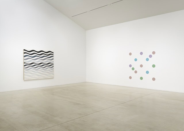
Riley learnt to draw by the sea in Cornwall, as a bored evacuee, and has often said her work references coastal landscapes – just as Turner learnt to draw as a child sent away, down to Margate. You can see, in some of Riley’s works, for example the Current: Dark Colours series from 2025, distinctly landscape-y colours, and others like Streak 3 feel like the sea. Riley has said that she’s not just capturing a flat, static landscape but ‘the dynamism’ of nature.
And you can see her obsession with how colours sit together as continuing Turner’s tradition of using science to inform how he made his art. Think of those stories about him adding a dash of orange to bring a whole painting together.
Of course, it’s not all coastal – other works are inspired by other things. There are a number of paintings using Riley’s ‘Egyptian Palette’ from the 1980s, inspired by a trip to that country. These paintings – made almost exclusively of vertical or horizontal stripes,of roughly equal width – are very much of the decade. Post-modern, a little knowing. They feel like they were made for Terry Farrell’s MI6 building or the offices at John Outram’s pumping station on the Isle of Dogs. Or maybe just for the dockland flats of city yuppies – they’re paintings that feel like money. Fitting, as it was the Pharaohs and their wealth that inspired them.
And that detached, post-modernism – that’s where we get to that ‘on the other hand’. Artists have always worked with assistants, have always been more than just the paint they themselves put on a canvas. Michelangelo worked with Francesco Granacci to recruit assistants to paint the Sistine Chapel ceiling, but it’s Michelangelo’s masterpiece. So of course Riley works with assistants to make her work. And artists have often returned to the same work – there are many paintings by Monet of the water-lilies, at least five versions of Munch’s Scream. So of course the same idea can be explored again and again.
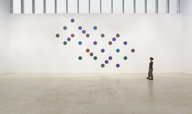
But Riley has taken these ideas a long way. The first work we see at Turner is titled ‘(Detail of) Bolt of Colour (Marfa), 2017’. It is presented here, painted directly onto the wall, as a copy of a section of Riley’s largest work to date, a wall painting at the Chinati Foundation in Marfa in Texas. But that work was a barely-altered copy of an original, earlier work, painted along the corridors of the Royal Liverpool University Hospital in 1983.
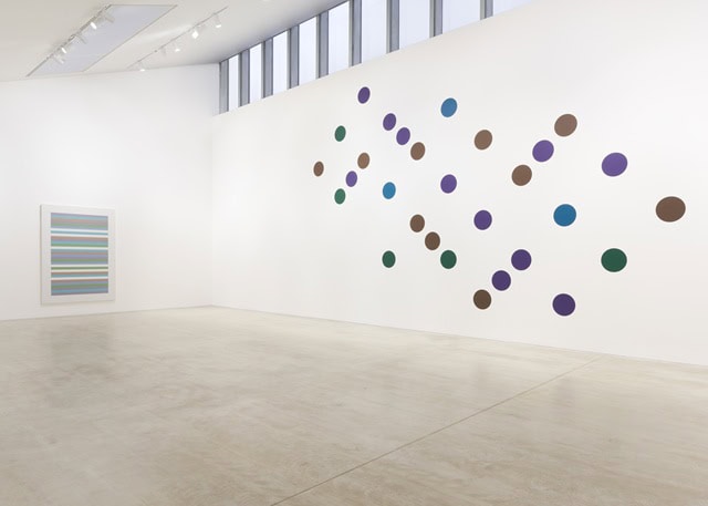
So while there was once an egalitarian work, made for the NHS, we’re seeing a copy of a copy of that, which was made for a Texan art foundation, and this copy is owned by a German gallery. I’m not sure where I sit with that, especially when the copy is as removed from its original context (in a hospital corridor, full of doors and signs, where it belonged to us) as this. There are other wall paintings here, paint applied directly to Turner’s walls, which also apparently belong to someone else. Post-modern, for sure, and perhaps incredibly apt for an age of digital editions, but it all feels a little art world tricksy.
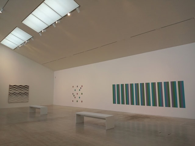
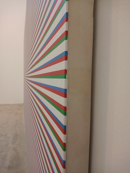
Because the original paintings, the actual canvases, are beautiful – as paintings but also as physical objects. I love the bare edges of a painting, where the canvas is stretched around the wooden stretcher behind it, because they offer a glimpse of the painter’s craft. Here, the stretchers are big and boxy, and you can see how carefully Riley’s paint has been applied, up to and sometimes over the edge. Look too at the studies on show in the Irene Willett gallery, that show Riley’s immaculate planning and preparation. Interestingly, they’re mostly in pencil and gouache – the favourite materials of old commercial artists and illustrators, and Riley worked as an illustrator at J. Walter Thompson advertising agency before finding success as an artist.
And that success is deserved, because Riley is (and it doesn’t need me to say this) a great artist. This is an exhibition of work that’s intellectually rigorous, exquisitely crafted, but which can also be easily enjoyed for the reaction it provokes. Sometimes, an instant physical reaction – be warned, there are vertigo-inducing moments in this exhibition, especially when you stand with paintings in your peripheral vision. But getting to be in the same room as some of Riley’s iconic works is an absolute treat – especially the real ones, where canvas is stretched over a wooden frame. They’re wonderful.

Rubbish.
Totally agree ,not even good rubbish
Brilliant – been looking forward to this one, especially as previous exhibition wasn’t my cup of tea. Hopefully going this weekend.
On one hand, it’s a collection of mostly large-scale works by a superstar artist, and it feels like this is exactly what architect David Chipperfield designed the building for.
Really Dan? A bunch of dots on a wall & a little bit of painting lines on? How is this major in any way? A child could do this.
As for the architect-it seems he built it for a different purpose-to celebrate Turner, not random doodles on walls, or other ‘artists’ dumping stuff on the floor, sticking random junk to walls etc. David Chipperfield designed the Turner Contemporary to be an iconic, yet functional, art gallery that honours the artist JMW Turner by capturing the light and sea he was inspired by in Margate.
Got it right ,99.9% of the time, it’s junk ,as you said child’s work get back to real art not this dross
Dan Thompson – the thinking man’s quilted velvet. Soft, strong and thoroughly absorbent.
I was fortunate to go on Friday evening and hear the artist herself talk about the exhibition. I was surprisingly moved by the impact some of the paintings had on me. I’ll be going back for another look.